Histogram
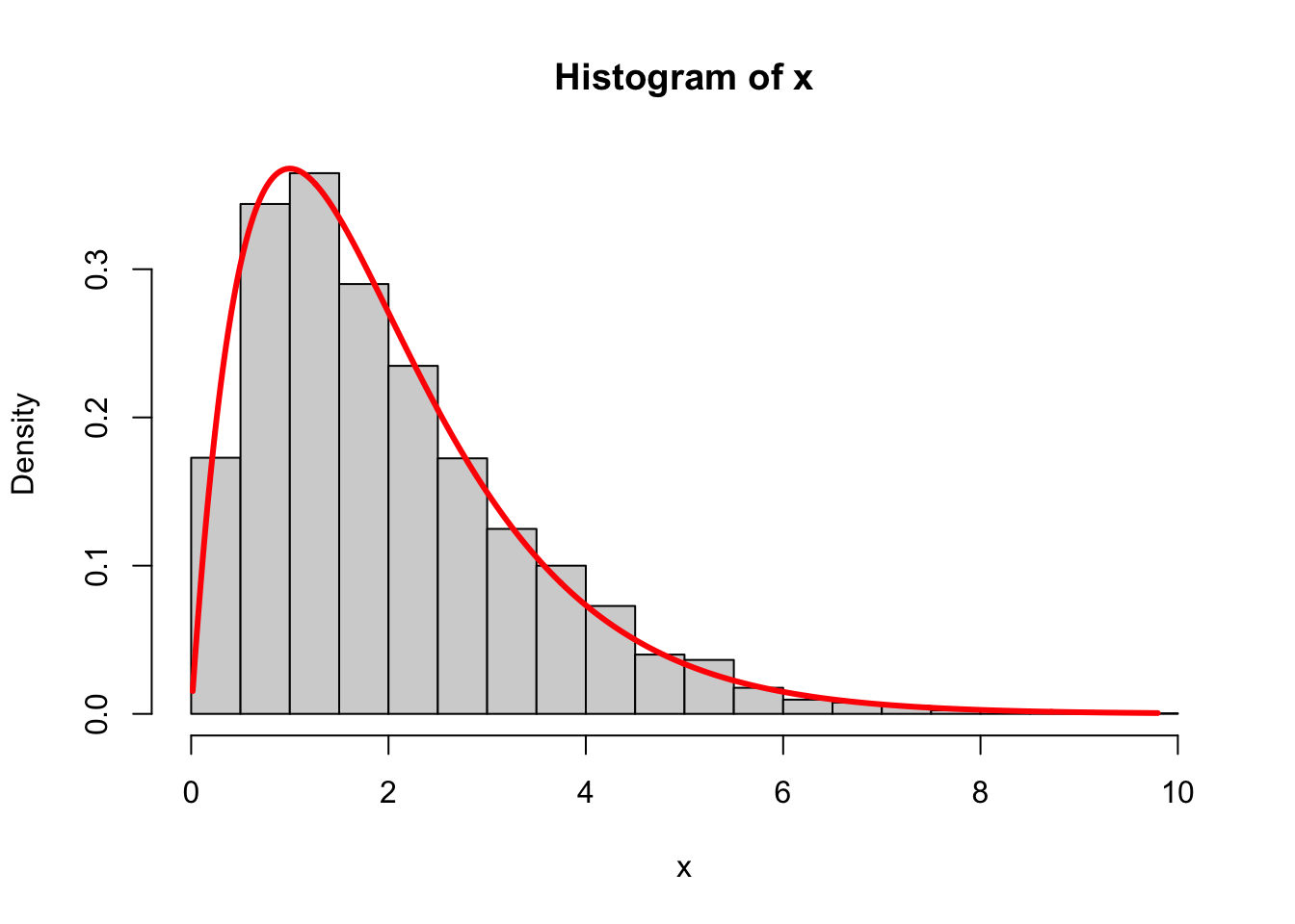
To visualize the distribution of a set of numbers, you can plot a histogram. If you keep studying statistics, you will learn that a histogram is a statistical estimator of a probability density function. Neat!
Anyway, this is super simple in R. Here is a vector of random numbers:
To plot a histogram, use the hist command:
hist(x, breaks = "Scott", freq = FALSE,
     main = "My histogram",
     xlab = "x values",
     ylab = "density",
     col = "lightblue",
     border = "white")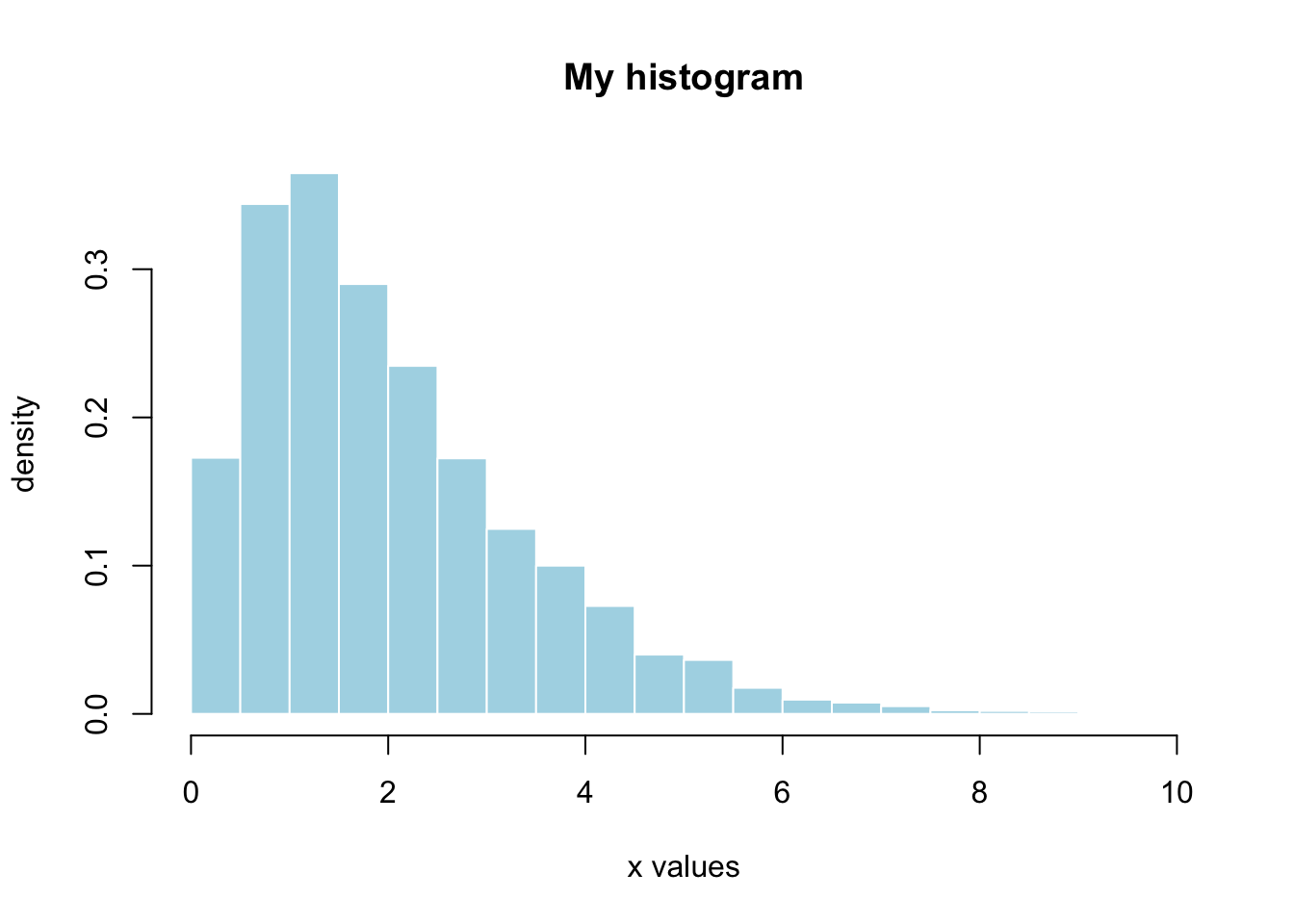
The hist command has many arguments, and you can read the documentation for more detail. Apart from the cosmetic stuff controlling the labeling and the color, there are three main arguments to think about:
- the first argument is obviously the vector of numbers whose distribution you want to visualize;
-
breaksdetermines the size of the bins (ie how many bars the histogram has). You can play around with different options, but I always setbreaks = "Scott"because David Scott was one of my professors in graduate school and he knows his shit. So we pour one out for David and setbreaks = "Scott"; - if you set
freq = TRUE, the height of the bars will correspond to the count of how many values fall into the bin.freq = FALSErenormalizes the bar heights so that the area under the histogram is literally one, and the histogram can be directly compared with a density, which we will often do.